# Image 图片
# 引入
在 app.json 或 index.json 中引入组件,详细介绍见快速上手
"usingComponents": {
  "lin-image": "/dist/image/index"
}
# 基础用法
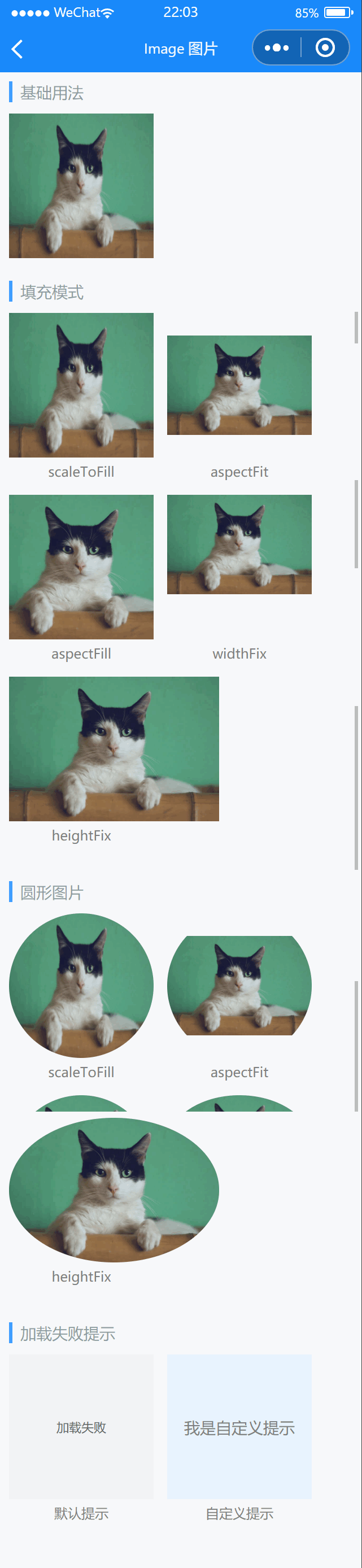
基础用法与原生 image 标签一致,可以设置src、width、height等原生属性
代码示例
<lin-image imageUrl="{ {['/images/cat.png']}}" width="300rpx" height="300rpx" />
# 填充模式
通过mode属性可以设置图片填充模式
代码示例
<lin-image
  mode="scaleToFill"
  imageUrl="{ {['/images/cat.png']}}"
  width="300rpx"
  height="300rpx"
/>
<lin-image
  mode="aspectFit"
  imageUrl="{ {['/images/cat.png']}}"
  width="300rpx"
  height="300rpx"
/>
<lin-image
  mode="aspectFill"
  imageUrl="{ {['/images/cat.png']}}"
  width="300rpx"
  height="300rpx"
/>
<lin-image
  mode="widthFix"
  imageUrl="{ {['/images/cat.png']}}"
  width="300rpx"
  height="300rpx"
/>
<lin-image
  mode="heightFix"
  imageUrl="{ {['/images/cat.png']}}"
  width="300rpx"
  height="300rpx"
/>
# 圆形图片
通过round属性可以设置图片变圆
代码示例
<lin-image
  mode="scaleToFill"
  round
  imageUrl="{ {['/images/cat.png']}}"
  width="300rpx"
  height="300rpx"
/>
<lin-image
  mode="aspectFit"
  round
  imageUrl="{ {['/images/cat.png']}}"
  width="300rpx"
  height="300rpx"
/>
<lin-image
  mode="aspectFill"
  round
  imageUrl="{ {['/images/cat.png']}}"
  width="300rpx"
  height="300rpx"
/>
<lin-image
  mode="widthFix"
  round
  imageUrl="{ {['/images/cat.png']}}"
  width="300rpx"
  height="300rpx"
/>
<lin-image
  mode="heightFix"
  round
  imageUrl="{ {['/images/cat.png']}}"
  width="300rpx"
  height="300rpx"
/>
# 加载失败提示
Image组件提供了默认的加载失败提示,支持通过默认插槽自定义内容
代码示例
<lin-image imageUrl="{ {[]}}" width="300rpx" height="300rpx" />
<lin-image useErrorSlot imageUrl="{ {[]}}" width="300rpx" height="300rpx">
  <solt>
    <view class="error-view">
      <text>我是自定义提示</text>
    </view>
  </solt>
</lin-image>
# 属性
| 参数 | 说明 | 类型 | 可选值 | 默认值 |
|---|---|---|---|---|
| imageUrl | 图片地址,传入一个数组,第一个图片加载失败就回去加载下一个,如此类推直到全部加载失败 | Array | — | — |
| width | 宽度,默认单位 px | String, Number | — | 320px |
| height | 高度,默认单位 px | String,Number | — | 240px |
| useErrorSlot | 是否使用 error 插槽 | String | — | false |
| errorTip | 错误提示 | String | — | — |
| radius | 圆角大小,默认单位为 px | String, Number | — | — |
| round | 是否显示为圆形 | Boolean | — | false |
| mode | 图片填充模式 | String | — | scaleToFill |
| webp | 默认不解析 webP 格式,只支持网络资源 | Boolean | — | false |
| lazyLoad | 是否懒加载 | Boolean | — | false |
| showMenuByLongpress | 是否开启长按图片显示识别小程序码菜单 | Boolean | — | false |
| showLoading | 是否展示图片加载中提示 | Boolean | — | true |
| loadingSize | 加载组件大小 | String, Number | — | — |
| loadingColor | 加载组件颜色 | String, Number | — | — |
| useLoadingSlot | 是否使用 loading 插槽 | Boolean | — | false |
# 事件
| 事件名 | 说明 | 参数 |
|---|---|---|
| bind:error | 所有图片加载失败时触发 | [{index:index,src:src,event:event}] |
| bind:success | 图片加载成功时触发 | {index:index,src:src,event:event} |
| bind:click | 点击图片时触发 | event |
# 插槽
| 插槽名称 | 说明 |
|---|---|
| — | Image 图片加载失败显示的内容 |
| loading | 自定义加载中的提示内容 |
# 外部样式类
| 类名 | 说明 |
|---|---|
| custom-class | 根节点样式类 |
| image-class | 图片样式类 |
| error-class | 错误提示样式类 |
| loading-class | 加载样式类 |
← Icon 图标 Loading 加载 →