# Steps 步骤条
# 引入
在 app.json 或 index.json 中引入组件,详细介绍见快速上手
"usingComponents": {
  "lin-steps": "/dist/steps/index"
}
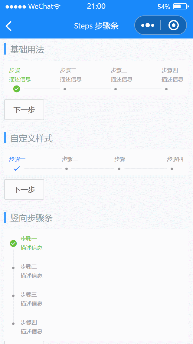
# 基础用法
通过steps属性设置步骤,active属性设置当前步骤
代码示例
<lin-steps steps="{ { steps1 }}" active="{ { active1 }}" />
<lin-button data-steps="steps1" data-key="active1" bind:click="onClick"
  >下一步</lin-button
>
Page({
  data: {
    steps1: [
      {
        text: "步骤一",
        desc: "描述信息",
      },
      {
        text: "步骤二",
        desc: "描述信息",
      },
      {
        text: "步骤三",
        desc: "描述信息",
      },
      {
        text: "步骤四",
        desc: "描述信息",
      },
    ],
    active1: 0,
  },
  onClick(event) {
    const { steps, key } = event.currentTarget.dataset;
    let index = this.data[key] + 1;
    const list = this.data[steps];
    if (index >= list.length) {
      index = 0;
    }
    this.setData({
      [key]: index,
    });
  },
});
# 自定义样式
可以通过 active-icon 和 active-color 属性设置激活状态下的图标和颜色
代码示例
<lin-steps
  steps="{ { steps2 }}"
  active="{ { active2 }}"
  active-color="#38f"
  active-icon="success"
/>
<lin-button data-steps="steps2" data-key="active2" bind:click="onClick"
  >下一步</lin-button
>
Page({
  data: {
    steps2: [
      {
        text: "步骤一",
      },
      {
        text: "步骤二",
      },
      {
        text: "步骤三",
      },
      {
        text: "步骤四",
      },
    ],
    active2: 0,
  },
  onClick(event) {
    const { steps, key } = event.currentTarget.dataset;
    let index = this.data[key] + 1;
    const list = this.data[steps];
    if (index >= list.length) {
      index = 0;
    }
    this.setData({
      [key]: index,
    });
  },
});
# 竖向步骤条
可以通过设置direction属性来改变步骤条的显示方式
代码示例
<lin-steps steps="{ { steps1 }}" active="{ { active3 }}" direction="vertical" />
<lin-button data-steps="steps1" data-key="active3" bind:click="onClick"
  >下一步</lin-button
>
Page({
  data: {
    steps1: [
      {
        text: "步骤一",
        desc: "描述信息",
      },
      {
        text: "步骤二",
        desc: "描述信息",
      },
      {
        text: "步骤三",
        desc: "描述信息",
      },
      {
        text: "步骤四",
        desc: "描述信息",
      },
    ],
    active3: 0,
  },
  onClick(event) {
    const { steps, key } = event.currentTarget.dataset;
    let index = this.data[key] + 1;
    const list = this.data[steps];
    if (index >= list.length) {
      index = 0;
    }
    this.setData({
      [key]: index,
    });
  },
});
# 属性
| 参数 | 说明 | 类型 | 可选值 | 默认值 |
|---|---|---|---|---|
| steps | 步骤 | Array:[{text:string,desc:string}] | — | — |
| active | 当前步骤 | Number | — | 0 |
| direction | 显示方向 | String | horizontal, vertical | horizontal |
| activeColor | 激活状态颜色 | String | — | — |
| inactiveColor | 未激活状态颜色 | String | — | — |
| activeIcon | 激活状态底部图标 | String | — | round-active |
| inactiveIcon | 未激活状态底部图标 | String | — | — |
# 外部样式类
| 类名 | 说明 |
|---|---|
| custom-class | 根节点样式类 |
| step-class | 步骤项样式类 |
| message-class | 文本样式类 |
| circle-class | 图标样式类 |
| line-class | 线条样式类 |