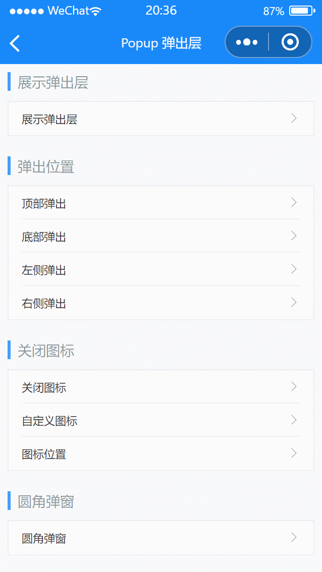
# Popup 弹出层
# 引入
在 app.json 或 index.json 中引入组件,详细介绍见快速上手
"usingComponents": {
  "lin-popup": "/dist/popup/index"
}
# 基础使用
通过show属性控制弹出层是否展示
代码示例
<lin-cell-group>
  <lin-cell
    data-show="show1"
    bind:click="setShowData"
    title="展示弹出层"
    is-link
  />
</lin-cell-group>

<lin-popup safeAreaInsetBottom='{ {false}}' data-show="show1" show="{ {show1}}" bind:mask-click="onMaskClick">
  <view style="padding: 30px 50px;">内容</view>
</lin-popup>
Page({
  data: {
    show1: false,
  },
  setShowData(event) {
    const key = event.currentTarget.dataset.show;
    this.setData({ [key]: true });
  },

  onMaskClick(event) {
    const key = event.currentTarget.dataset.show;
    this.setData({ [key]: false });
  },
});
# 弹出位置
通过position属性设置弹出位置,默认居中弹出,可以设置为top、bottom、left、right
代码示例
<lin-cell-group>
  <lin-cell
    data-show="show2"
    bind:click="setShowData"
    title="顶部弹出"
    is-link
  />
  <lin-cell
    data-show="show3"
    bind:click="setShowData"
    title="底部弹出"
    is-link
  />
  <lin-cell
    data-show="show4"
    bind:click="setShowData"
    title="左侧弹出"
    is-link
  />
  <lin-cell
    data-show="show5"
    bind:click="setShowData"
    title="右侧弹出"
    is-link
  />
</lin-cell-group>

<lin-popup
 safeAreaInsetBottom='{ {false}}'
  data-show="show2"
  show="{ { show2 }}"
  bind:mask-click="onMaskClick"
  position="top"
  custom-style="height: 20%;"
/>

<lin-popup
  data-show="show3"
  show="{ { show3 }}"
  bind:mask-click="onMaskClick"
  position="bottom"
  custom-style="height: 20%;"
/>

<lin-popup
 safeAreaInsetBottom='{ {false}}'
  data-show="show4"
  show="{ { show4 }}"
  bind:mask-click="onMaskClick"
  position="left"
  custom-style="width: 50%;height:100%;"
/>

<lin-popup
 safeAreaInsetBottom='{ {false}}'
  data-show="show5"
  show="{ { show5 }}"
  bind:mask-click="onMaskClick"
  position="right"
  custom-style="width: 50%;height:100%;"
/>
Page({
  data: {
    show2: false,
    show3: false,
    show4: false,
    show5: false,
  },
  setShowData(event) {
    const key = event.currentTarget.dataset.show;
    this.setData({ [key]: true });
  },

  onMaskClick(event) {
    const key = event.currentTarget.dataset.show;
    this.setData({ [key]: false });
  },
});
# 关闭图标
设置closeable属性后,会在弹出层的右上角显示关闭图标,并且可以通过close-icon属性自定义图标,使用close-icon-position属性可以自定义图标位置
代码示例
<lin-cell-group>
  <lin-cell
    data-show="show6"
    bind:click="setShowData"
    title="关闭图标"
    is-link
  />
  <lin-cell
    data-show="show7"
    bind:click="setShowData"
    title="自定义图标"
    is-link
  />
  <lin-cell
    data-show="show8"
    bind:click="setShowData"
    title="图标位置"
    is-link
  />
</lin-cell-group>
<lin-popup
  closeIconSize="20px"
  data-show="show6"
  show="{ { show6 }}"
  closeable
  bind:mask-click="onMaskClick"
  bind:close="onMaskClick"
  position="bottom"
  custom-style="height: 20%;"
/>

<lin-popup
  closeIcon="delete"
  data-show="show7"
  show="{ { show7 }}"
  closeable
  bind:mask-click="onMaskClick"
  bind:close="onMaskClick"
  position="bottom"
  custom-style="height: 20%;"
/>

<lin-popup
  closeIconPosition="top-left"
  data-show="show8"
  show="{ { show8 }}"
  closeable
  bind:mask-click="onMaskClick"
  bind:close="onMaskClick"
  position="bottom"
  custom-style="height: 20%;"
/>
Page({
  data: {
    show6: false,
    show7: false,
    show8: false,
  },
  setShowData(event) {
    const key = event.currentTarget.dataset.show;
    this.setData({ [key]: true });
  },

  onMaskClick(event) {
    const key = event.currentTarget.dataset.show;
    this.setData({ [key]: false });
  },
});
# 圆角弹窗
设置round属性后,弹窗会根据弹出位置添加不同的圆角样式
代码示例
<lin-cell-group>
  <lin-cell
    data-show="show9"
    bind:click="setShowData"
    title="圆角弹窗"
    is-link
  />
</lin-cell-group>
<lin-popup
  data-show="show9"
  round
  show="{ { show9 }}"
  bind:mask-click="onMaskClick"
  position="bottom"
  custom-style="height: 20%;"
/>
Page({
  data: {
    show9: false,
  },
  setShowData(event) {
    const key = event.currentTarget.dataset.show;
    this.setData({ [key]: true });
  },

  onMaskClick(event) {
    const key = event.currentTarget.dataset.show;
    this.setData({ [key]: false });
  },
});
# 属性
| 参数 | 说明 | 类型 | 可选值 | 默认值 |
|---|---|---|---|---|
| zIndex | z-index 层级 | Number | — | 100 |
| mask | 是否显示遮罩层 | Boolean | — | true |
| maskStyle | 自定义遮罩层样式 | String | — | — |
| position | 弹出位置 | String | top,bottom,right,left,center | center |
| closeable | 是否显示关闭图标 | Boolean | — | false |
| closeIcon | 关闭图标名称 | String | — | close |
| closeIconPosition | 关闭图标的位置 | String | top-right,top-left,bottom-right,bottom-left | top-right |
| closeOnClickMask | 是否在点击遮罩层后关闭 | Boolean | — | true |
| closeIconSize | 关闭图标大小 | String,Number | — | 40rpx |
| round | 是否显示圆角 | Boolean | — | false |
| transition | 动画类型,优先级高于 position | String | — | — |
| customStyle | 自定义样式 | String | — | — |
| show | 是否展示组件 | Boolean | — | true |
| duration | 动画时长,单位为毫秒 | Number | Object:{enter: number, leave: number} | — |
| safeAreaInsetBottom | 是否为 iPhoneX 留出底部安全距离 | Boolean | — | true |
| safeAreaInsetTop | 是否留出顶部安全距离(状态栏高度) | Boolean | — | false |
# 事件
| 事件名 | 说明 | 参数 |
|---|---|---|
| bind:mask-click | 点击遮罩层时触发 | — |
| bind:close | 关闭弹出层时触发 | — |
| bind:before-enter | 进入前触发 | — |
| bind:enter | 进入中触发 | — |
| bind:after-enter | 进入后触发 | — |
| bind:before-leave | 离开前触发 | — |
| bind:leave | 离开中触发 | — |
| bind:after-leave | 离开后触发 | — |
# 外部样式类
| 类名 | 说明 |
|---|---|
| custom-class | 根节点样式类 |