# Dialog 弹出框
# 介绍
弹出模态框,常用于消息提示、消息确认、在当前页面内完成特定的交互操作
弹出框组件支持函数调用和组件调用两种方式
# 引入
在 app.json 或 index.json 中引入组件,详细介绍见快速上手
"usingComponents": {
  "lin-dialog": "/dist/dialog/index"
}
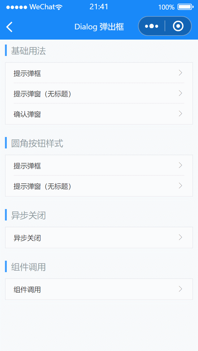
# 基础用法
代码示例
<lin-cell-group>
  <lin-cell title="提示弹框" is-link bind:click="onClick1" />
  <lin-cell title="提示弹窗(无标题)" is-link bind:click="onClick2" />
  <lin-cell
    title="确认弹窗"
    is-link
    bind:click="onClick3"
    border="{ { false }}"
  />
</lin-cell-group>

<lin-dialog id="lin-dialog" />
import Dialog from "/dist/Dialog/dialog.js";
Page({
  onClick1() {
    Dialog.alert({
      title: "标题",
      message: "弹窗内容",
    }).then(() => {});
  },
  onClick2() {
    Dialog.alert({
      message: "弹窗内容",
    }).then(() => {});
  },
  onClick3() {
    Dialog.confirm({
      title: "标题",
      message: "弹窗内容",
    })
      .then(() => {})
      .catch(() => {});
  },
});
# 圆角按钮样式
将 theme 选项设置为 round-button 可以展示圆角按钮风格的弹窗。
代码示例
<lin-cell-group>
  <lin-cell title="提示弹框" is-link bind:click="onClick4" />
  <lin-cell
    title="提示弹窗(无标题)"
    is-link
    bind:click="onClick5"
    border="{ { false }}"
  />
</lin-cell-group>

<lin-dialog id="lin-dialog" />
import Dialog from "/dist/Dialog/dialog.js";
Page({
  onClick4() {
    Dialog.alert({
      title: "标题",
      message: "弹窗内容",
      theme: "round-button",
    }).then(() => {
      // on close
    });
  },
  onClick5() {
    Dialog.alert({
      message: "弹窗内容",
      theme: "round-button",
    }).then(() => {
      // on close
    });
  },
});
# 异步关闭
通过asyncClose属性可实现异步关闭,此时需要手动关闭Dialog
代码示例
<lin-cell-group>
  <lin-cell
    title="异步关闭"
    is-link
    bind:click="onClick6"
    border="{ { false }}"
  />
</lin-cell-group>

<lin-dialog id="lin-dialog" />
import Dialog from "/dist/Dialog/dialog.js";
Page({
  onClick6() {
    Dialog.confirm({
      title: "标题",
      message: "弹窗内容",
      asyncClose: true,
    })
      .then(() => {
        setTimeout(() => {
          Dialog.close();
        }, 1000);
      })
      .catch(() => {
        Dialog.close();
      });
  },
});
# 组件调用
如果需要在弹窗内嵌入组件或其他自定义内容,可以使用组件调用的方式。
代码示例
<lin-cell-group>
  <lin-cell
    title="组件调用"
    is-link
    bind:click="onClick7"
    border="{ { false }}"
  />
</lin-cell-group>

<lin-dialog
  use-slot
  title="标题"
  show="{ { show }}"
  show-cancel-button
  confirm-button-open-type="share"
  bind:close="onClose"
>
  <image class="dialog-image" src="/images/cat.png" />
</lin-dialog>
Page({
  data: {
    show: false,
  },
  onClick7() {
    this.setData({
      show: true,
    });
  },
  onClose() {
    this.setData({ show: false });
  },
});
# 方法
| 方法名 | 参数 | 返回值 | 介绍 |
|---|---|---|---|
| Dialog | options | Promise | 展示弹窗 |
| Dialog.alert | options | Promise | 展示消息提示弹窗 |
| Dialog.confirm | options | Promise | 展示消息确认弹窗 |
| Dialog.setDefaultOptions | options | void | 修改默认配置,对所有 Dialog 生效 |
| Dialog.resetDefaultOptions | — | void | 重置默认配置,对所有 Dialog 生效 |
| Dialog.close | — | void | 关闭弹窗 |
| Dialog.stopLoading | — | void | 停止按钮的加载状态 |
# Options
通过函数调用 Dialog 时,支持传入以下选项:
| 参数 | 说明 | 类型 | 可选值 | 默认值 |
|---|---|---|---|---|
| title | 标题 | String | — | — |
| width | 弹窗宽度,默认单位为 px | String, Number | — | 640rpx |
| theme | 样式风格 | String | default,round-button | default |
| message | 文本内容 | String | — | — |
| zIndex | z-index 层级 | Number | — | 100 |
| mask | 是否展示遮罩层 | Boolean | — | true |
| selector | 自定义选择器 | String | — | #lin-dialog |
| className | 自定义类名 | String | — | — |
| asyncClose | 是否异步关闭 | Boolean | — | false |
| transition | 动画名称 | String | — | scale |
| customStyle | 自定义样式 | String | — | — |
| messageAlign | 内容对齐方式 | String | center,left,right | center |
| maskStyle | 自定义遮罩层样式 | String | — | — |
| confirmButtonText | 确认按钮的文案 | String | — | 确认 |
| cancelButtonText | 取消按钮的文案 | String | — | 取消 |
| showConfirmButton | 是否展示确认按钮 | Boolean | — | true |
| showCancelButton | 是否展示取消按钮 | Boolean | — | false |
| closeOnClickMask | 确认按钮的文案 | Boolean | — | false |
| confirmButtonOpenType | 确认按钮的微信开放能力,具体支持可参考 微信官方文档 (opens new window) | String | — | — |
| context | 选择器的选择范围,可以传入自定义组件的 this 作为上下文 | Object | — | 当前页面 |
# OpenType Options
使用confirmButtonOpenType后,支持以下选项:
| 参数 | 说明 | 类型 | 默认值 | open-type |
|---|---|---|---|---|
| appParameter | 打开 APP 时,向 APP 传递的参数 | String | — | launchApp |
| lang | 指定返回用户信息的语言,zh_CN 简体中文, | |||
| zh_TW 繁体中文,en 英文 | String | en | getUserInfo | |
| sessionFrom | 会话来源 | String | — | contact |
| businessId | 客服消息子商户 id | Number | — | contact |
| sendMessageTitle | 会话内消息卡片标题 | String | 当前标题 | contact |
| sendMessagePath | 会话内消息卡片点击跳转小程序路径 | String | 当前分享路径 | contact |
| sendMessageImg | sendMessageImg | String | 截图 | contact |
| showMessageCard | 显示会话内消息卡片 | Boolean | false | contact |
# Props
通过组件调用 Dialog 时,支持以下 Props:
| 参数 | 说明 | 类型 | 可选值 | 默认值 |
|---|---|---|---|---|
| show | 是否显示弹窗 | Boolean | — | false |
| title | 标题 | String | — | — |
| message | 文本内容 | String | — | — |
| theme | 样式风格 | String | default, round-button | default |
| useSlot | 是否使用自定义内容的插槽 | Boolean | — | false |
| className | 自定义类名 | String | — | — |
| customStyle | 自定义样式 | String | — | — |
| asyncClose | 是否异步关闭 | Boolean | — | false |
| messageAlign | 内容对齐方式 | String | center, left, right | center |
| maskStyle | 自定义遮罩层样式 | String | — | — |
| useTitleSlot | 是否使用自定义标题的插槽 | Boolean | — | false |
| closeOnClickMask | 点击遮罩层时是否关闭弹窗 | Boolean | — | false |
| confirmButtonOpenType | 确认按钮的微信开放能力,具体支持可参考 微信官方文档 (opens new window) | String | — | — |
| width | 弹窗宽度,默认单位为 px | String, Number | — | 640rpx |
| zIndex | z-index 层级 | Number | — | 2000 |
| confirmButtonText | 确认按钮的文案 | String | — | 确认 |
| cancelButtonText | 取消按钮的文案 | String | — | 取消 |
| confirmButtonColor | 确认按钮的字体颜色 | String | — | — |
| cancelButtonColor | 取消按钮的字体颜色 | String | — | — |
| showConfirmButton | 是否展示确认按钮 | Boolean | — | true |
| mask | 是否展示遮罩层 | Boolean | — | true |
| transition | 动画名称 | String | — | scale |
# OpenType Props
使用confirmButtonOpenType后,支持以下选项:
| 参数 | 说明 | 类型 | 默认值 | open-type |
|---|---|---|---|---|
| appParameter | 打开 APP 时,向 APP 传递的参数 | String | — | launchApp |
| lang | 指定返回用户信息的语言,zh_CN 简体中文, | |||
| zh_TW 繁体中文,en 英文 | String | en | getUserInfo | |
| sessionFrom | 会话来源 | String | — | contact |
| businessId | 客服消息子商户 id | Number | — | contact |
| sendMessageTitle | 会话内消息卡片标题 | String | 当前标题 | contact |
| sendMessagePath | 会话内消息卡片点击跳转小程序路径 | String | 当前分享路径 | contact |
| sendMessageImg | sendMessageImg | String | 截图 | contact |
| showMessageCard | 显示会话内消息卡片 | Boolean | false | contact |
# 事件
| 事件名 | 说明 | 参数 |
|---|---|---|
| bind:close | 弹窗关闭时触发 | 关闭事件来源,枚举为mask,confirm,cancel |
| bind:mask | 点击遮罩层时触发 | dialog 实例 |
| bind:confirm | 点击确认按钮时触发 | dialog 实例 |
| bind:cancel | 点击取消按钮时触发 | dialog 实例 |
| bind:getuserinfo | 用户点击该按钮时,会返回获取到的用户信息,从返回参数的 detail 中获取到的值同 wx.getUserInfo | event |
| bind:contact | 客服消息回调 | event |
| bind:getphonenumber | 获取用户手机号回调 | event |
| bind:error | 当使用开放能力时,发生错误的回调 | event |
| bind:opensetting | 在打开授权设置页后回调 | event |
| bind:launchapp | 打开 APP 成功的回调 | event |
# 外部样式类
| 类名 | 说明 |
|---|---|
| custom-class | 根节点样式类 |
| header-class | 标题样式类 |
| content-class | 内容样式类 |
| footer-class | 底部样式类 |
| cancel-class | 取消按钮样式类 |
| confirm-class | 确认按钮样式类 |