# PasswordKeyboard 密码键盘
# 引入
在 app.json 或 index.json 中引入组件,详细介绍见快速上手
"usingComponents": {
  "lin-password-keyboard": "/dist/password-keyboard/index"
}
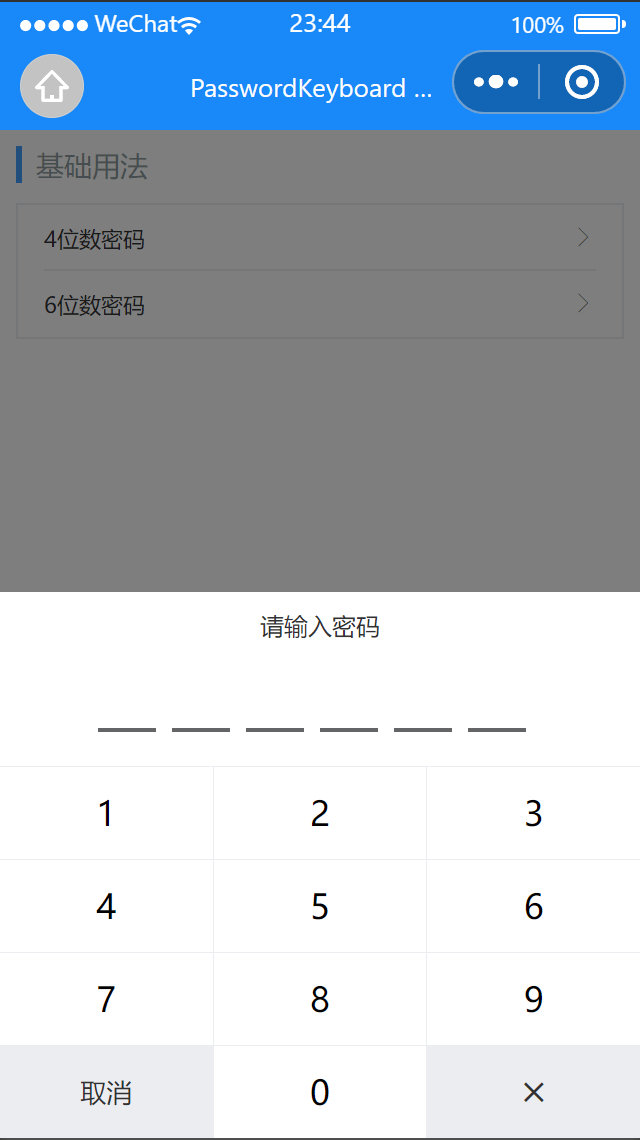
# 基础用法
可通过 length 属性来控制输入的密码长度
代码示例
<lin-cell-group>
  <lin-cell
    title="4位数密码"
    data-show="show1"
    bind:click="onBtnClick"
    is-link
  />
  <lin-cell
    title="6位数密码"
    data-show="show2"
    bind:click="onBtnClick"
    is-link
    border="{ { false }}"
  />
</lin-cell-group>

<lin-password-keyboard
  closeOnClickMask
  length="4"
  data-length="4"
  data-valueKey="inputValue1"
  data-show="show1"
  bind:close="onClose"
  bind:input="onInput"
  bind:del="onDelete"
  inputValue="{ {inputValue1}}"
  show="{ {show1}}"
/>
<lin-password-keyboard
  closeOnClickMask
  length="6"
  data-length="6"
  data-valueKey="inputValue2"
  data-show="show2"
  bind:close="onClose"
  bind:input="onInput"
  bind:del="onDelete"
  inputValue="{ {inputValue2}}"
  show="{ {show2}}"
/>
Page({
  data: {
    show1: false,
    inputValue1: [],
    show2: false,
    inputValue2: []
  },
  onBtnClick(event) {
    const { show, valuekey } = event.currentTarget.dataset;
    this.setData({
      [show]: true,
      [valuekey]: []
    });
  },
  onInput(event) {
    const { valuekey, length, show } = event.currentTarget.dataset;
    const value = event.detail;
    const inputVal = this.data[valuekey];
    inputVal.push(value);
    this.setData({
      [valuekey]: inputVal
    });
    if (inputVal.length === length * 1) {
      wx.showToast({
        title: `输入的密码是${inputVal.join('')}`,
        icon: 'none'
      });
      this.setData({
        [show]: false,
        [valuekey]: []
      });
    }
  },
  onDelete(event) {
    const { valuekey } = event.currentTarget.dataset;
    const inputVal = this.data[valuekey];
    inputVal.pop();
    this.setData({
      [valuekey]: inputVal
    });
  },
  onClose(event) {
    const { show, valuekey } = event.currentTarget.dataset;
    this.setData({
      [show]: false,
      [valuekey]: []
    });
  }
});
# 属性
| 参数 | 说明 | 类型 | 可选值 | 默认值 |
|---|---|---|---|---|
| safeAreaInsetBottom | 是否为 iPhoneX 留出底部安全距离 | Boolean | — | true |
| show | 是否显示 | Boolean | — | false |
| closeOnClickMask | 是否在点击选项后关闭 | Boolean | — | false |
| zIndex | 层级 | Number | — | 100 |
| mask | 是否显示遮罩层 | Boolean | — | true |
| length | 密码长度 | Number | — | 4 |
| inputValue | 输入框的值 | Array | — | — |
| title | 标题 | String | — | 请输入密码 |
| useTitleSlot | 是否使用标题插槽 | Boolean | — | false |
| useInputSlot | 是否使用输入框插槽 | Boolean | — | false |
# 事件
| 事件名 | 说明 | 参数 |
|---|---|---|
| bind:click | 点击键盘按键时触发 | event |
| bind:input | 点击数字按键时触发 | 按键内容 |
| bind:del | 点击删除按键时触发 | 按键内容 |
| bind:close | 点击取消按键时触发或者点击遮罩层(closeOnClickMask=true)时触发 | — |
# 插槽
| 插槽名称 | 说明 |
|---|---|
| title | 自定义 标题,useTitleSlot为true时生效 |
| input | 自定义 密码框,useInputSlot为true时生效 |
# 外部样式类
| 类名 | 说明 |
|---|---|
| custom-class | 根节点样式类 |
| title-class | 标题样式类 |
| input-container-class | 输入框容器样式类 |
| input-item-class | 输入框样式类 |
| num-container-class | 键盘容器样式类 |
| num-row-class | 键盘每一行样式类 |
| num-item-class | 键盘按键样式类 |