# IndexBar 索引栏
# 引入
在 app.json 或 index.json 中引入组件,详细介绍见快速上手
"usingComponents": {
   "lin-index-bar": "/dist/index-bar/index",
   "lin-index-anchor": "/dist/index-anchor/index"
}
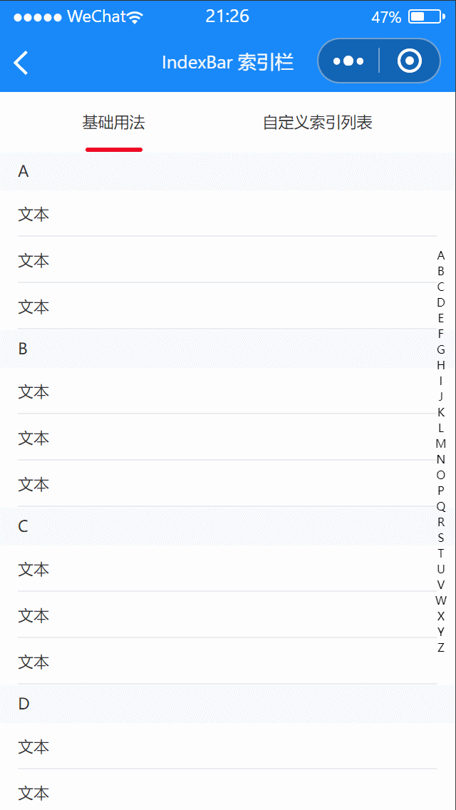
# 基础用法
点击索引栏时,会自动跳转到对应的IndexAnchor锚点位置
代码示例
<lin-index-bar>
  <lin-index-anchor index="{ {item}}" wx:for="{ {anchorList}}" wx:key="index">
    <lin-cell title="文本" wx:for="{ {3}}" wx:key="index" />
  </lin-index-anchor>
</lin-index-bar>
Page({
  data: {
    anchorList: [
      "A",
      "B",
      "C",
      "D",
      "E",
      "F",
      "G",
      "H",
      "I",
      "J",
      "K",
      "L",
      "M",
      "N",
      "O",
      "P",
      "Q",
      "R",
      "S",
      "T",
      "U",
      "V",
      "W",
      "X",
      "Y",
      "Z",
    ],
  },
});
# 自定义索引列表
可以通过index-list属性自定义展示的索引字符列表,
代码示例
<lin-index-bar>
  <lin-index-anchor
    index="{ {item}}"
    wx:for="{ {indexList}}"
    wx:key="index"
    useSlot
  >
    <view slot="index">
      标题-{ {item}}
    </view>
    <lin-cell title="文本" wx:for="{ {3}}" wx:key="index" />
  </lin-index-anchor>
</lin-index-bar>
Page({
  data: {
    indexList: [1, 2, 3, 4, 5, 6, 7, 8, 9, 10],
  },
});
# IndexBar 属性
| 参数 | 说明 | 类型 | 可选值 | 默认值 |
|---|---|---|---|---|
| zIndex | z-index 层级 | Number | — | 1 |
| sticky | 是否开启锚点自动吸顶 | Boolean | — | true |
| stickyOffsetTop | 锚点自动吸顶时与顶部的距离 | Number | — | 0 |
| highlightColor | 索引字符高亮颜色 | String | — | — |
# IndexBar 事件
| 事件名 | 说明 | 参数 |
|---|---|---|
| bind:select | 选中字符时触发 | index: 索引字符 |
# IndexBar 外部样式类
| 类名 | 说明 |
|---|---|
| custom-class | 根节点样式类 |
| sidebar-class | 侧边栏容器样式类 |
| sidebar-item-class | 侧边栏选项样式类 |
# IndexAnchor 属性
| 参数 | 说明 | 类型 | 可选值 | 默认值 |
|---|---|---|---|---|
| index | 索引字符 | String, Number | — | — |
| useSlot | 是否使用自定义内容的插槽 | Boolean | — | false |
# IndexAnchor 插槽
| 插槽名称 | 说明 |
|---|---|
| — | 自定义显示内容 |
| index | 自定义标题内容 |
# IndexAnchor 外部样式类
| 类名 | 说明 |
|---|---|
| custom-class | 根节点样式类 |
| index-class | 锚点样式类 |
← Grid 宫格 Sidebar 侧边导航 →