Card 商品卡片
引入
在 app.json 或 index.json 中引入组件,详细介绍见快速上手
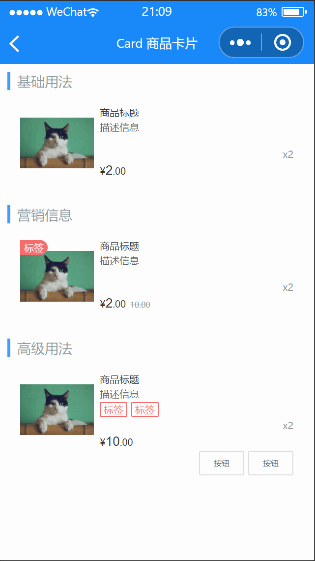
基础用法
代码示例
营销信息
代码示例
高级用法
代码示例
属性
| 参数 | 说明 | 类型 | 可选值 | 默认值 |
|---|
| thumb | 左侧图片 | String | — | — |
| thumbMode | 左侧图片裁剪、缩放的模式,可选值参考小程序 image 组件 mode 属性值 | String | — | aspectFit |
| title | 标题 | String | — | — |
| desc | 描述 | String | — | — |
| tag | 标签 | String | — | — |
| num | 商品数量 | String, Number | — | — |
| price | 商品价格 | String, Number | — | — |
| originPrice | 商品划线原价 | String, Number | — | — |
| currency | 货币符号 | String | — | ¥ |
| thumbLink | 点击左侧图片后跳转的链接地址 | String | — | — |
| lazyLoad | 是否开启图片懒加载 | Boolean | — | false |
| linkType | 链接跳转类型 | String | navigateTo, redirectTo, switchTab, reLaunch | navigateTo |
插槽
| 插槽名称 | 说明 |
|---|
| tag | 自定义图片角标,如果设置了tag属性则不生效 |
| thumb | 自定义图片,如果设置了thumb属性则不生效 |
| title | 自定义标题栏,如果设置了title属性则不生效 |
| desc | 自定义描述栏,如果设置了desc属性则不生效 |
| tags | 自定义描述下方标签区域 |
| price-top | 自定义价格上方区域 |
| price | 自定义价格 |
| origin-price | 自定义商品原价,如果设置了origin-price属性则不生效 |
| num | 自定义数量 |
| price-bottom | 自定义价格下方区域 |
| footer | 自定义右下角内容 |
外部样式类
| 类名 | 说明 |
|---|
| custom-class | 根节点样式类 |
| thumb-class | 图片容器样式类 |
| tag-class | 角标样式类 |
| image-class | 图片样式类 |
| content-class | 内容样式类 |
| title-class | 标题样式类 |
| desc-class | 描述样式类 |
| price-class | 价格样式类 |
| currency-class | 货币样式类 |
| integer-class | 整数样式类 |
| decimal-class | 小数样式类 |
| origin-price-class | 划线原价样式类 |
| num-class | 数量样式类 |